Community Redevelopment Agency (nonprofit)
Community Redevelopment Agency (CRA) logo
Lincolnville Community Redevelopment Agency (LCRA) logo
About the Brand
This nonprofit is targeting a public agency aiming to implement change at a local level being organized by Administrator Jamie D. Perkins. Her mission is to develop company rebranding for her organization: Community Redevelopment Center of St. Augustine (CRA). There is a joint branch under the agency that aids in redevelopment in the area of Lincolnville: LCRA. I am tasked with redesigning the company logo, the LCRA logo, and a brochure attached to the Lincolnville project detailing the ins and outs of the organization, as well as, benefits, and funding.
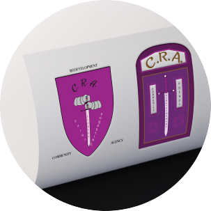
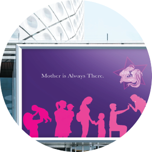
The CRA logo is a purple medieval shield with two iron gauntlets holding a sword in front. Purple is the signature color of CRA in all branding media items. Three gemstones are on the knuckles in the colors of the old logo. CRA initials of the organization are at the top of the shield. St. Augustine are in a diagonal where they meet at the tip of the sword. On the sword is Florida. On the borders of the shield is the name of the organization. The Lincolnville logo is a purple door to signify the beautiful Victorian architecture in the area. The company intials are in the arch window to give a stained glass appearance while the vertical windows have the company name spelled out. The sword from the CRA logo is placed in the middle to merge company affiliation. The brochure is also in purple with vintage embellishments. The old LCRA logo is featured and many details about the project are within the interior. This agency is determined to enact change and build a lasting foundation for the area.

")
")
")
")
View More Works Below!