Matsdotter Chocolates

Design Narrative
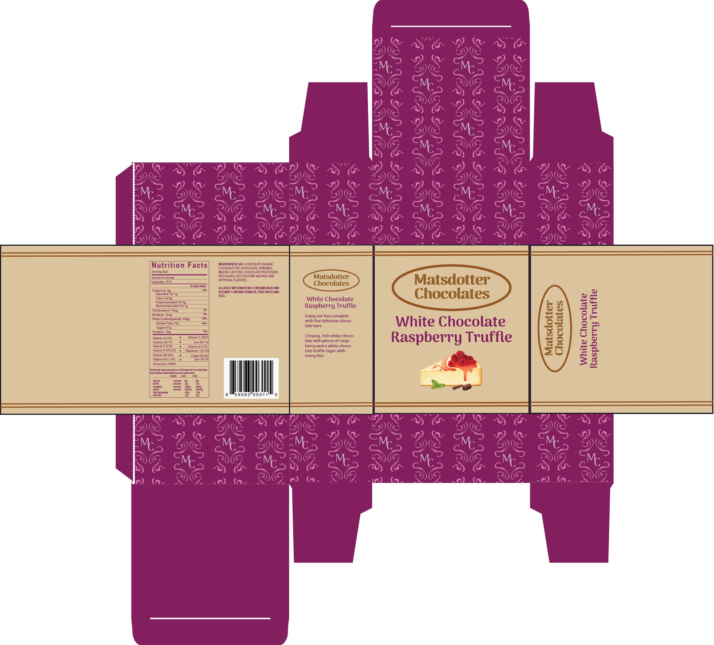
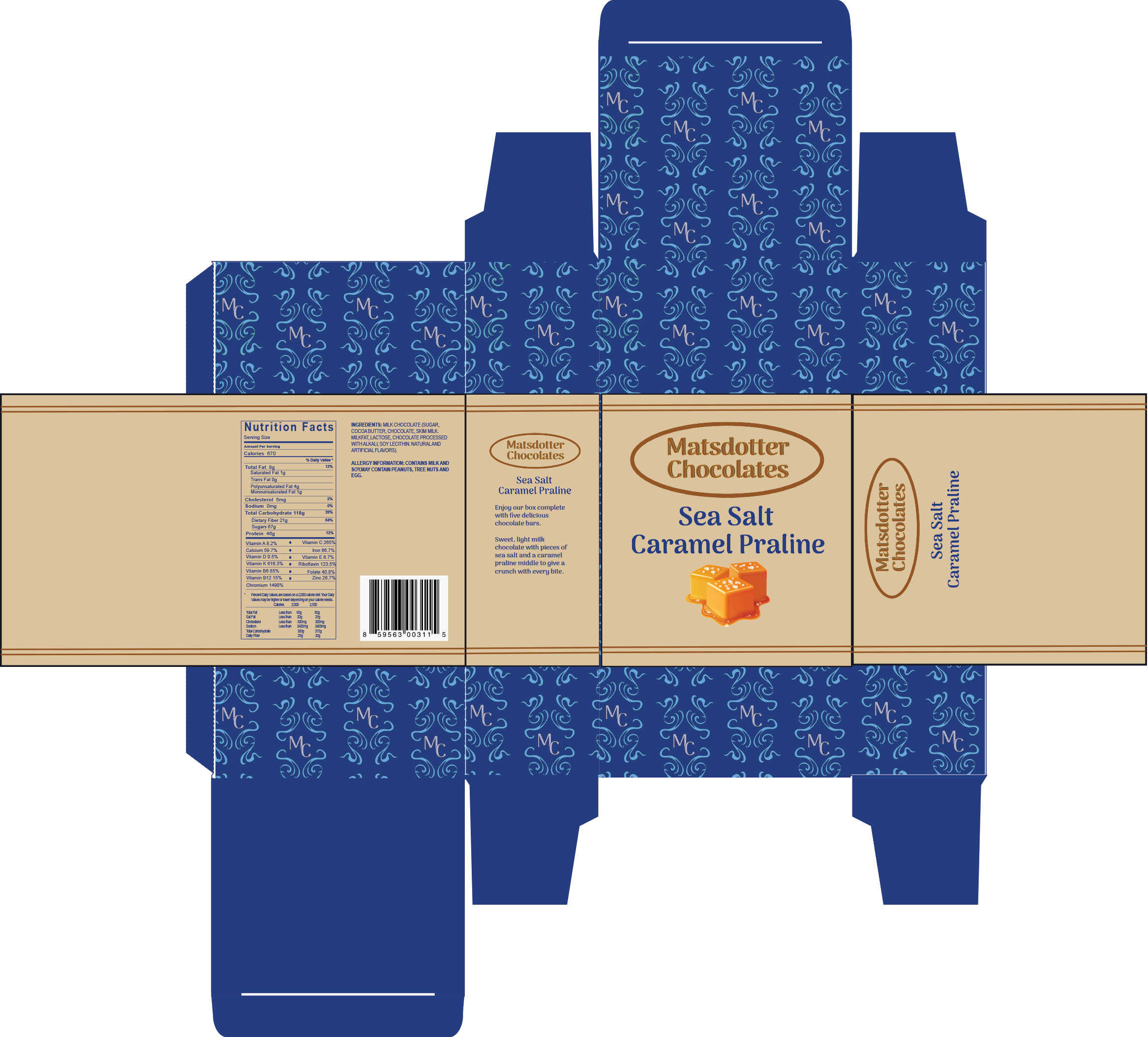
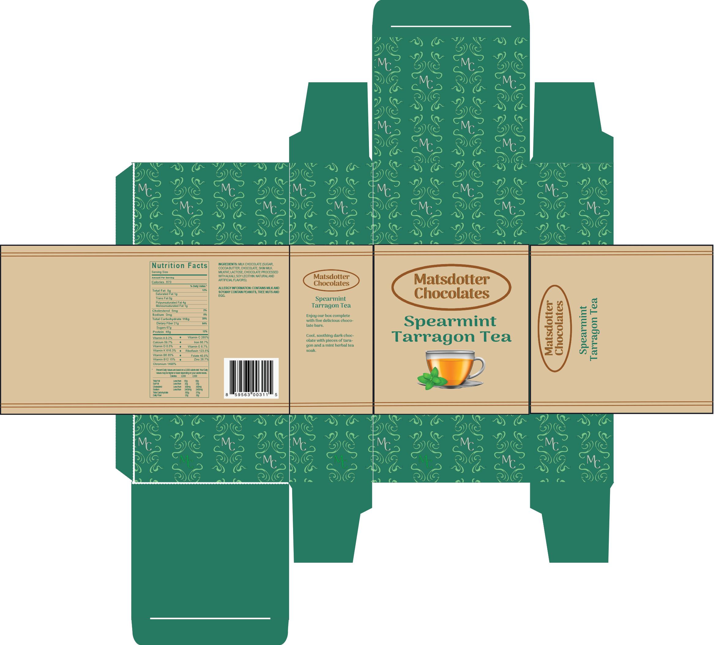
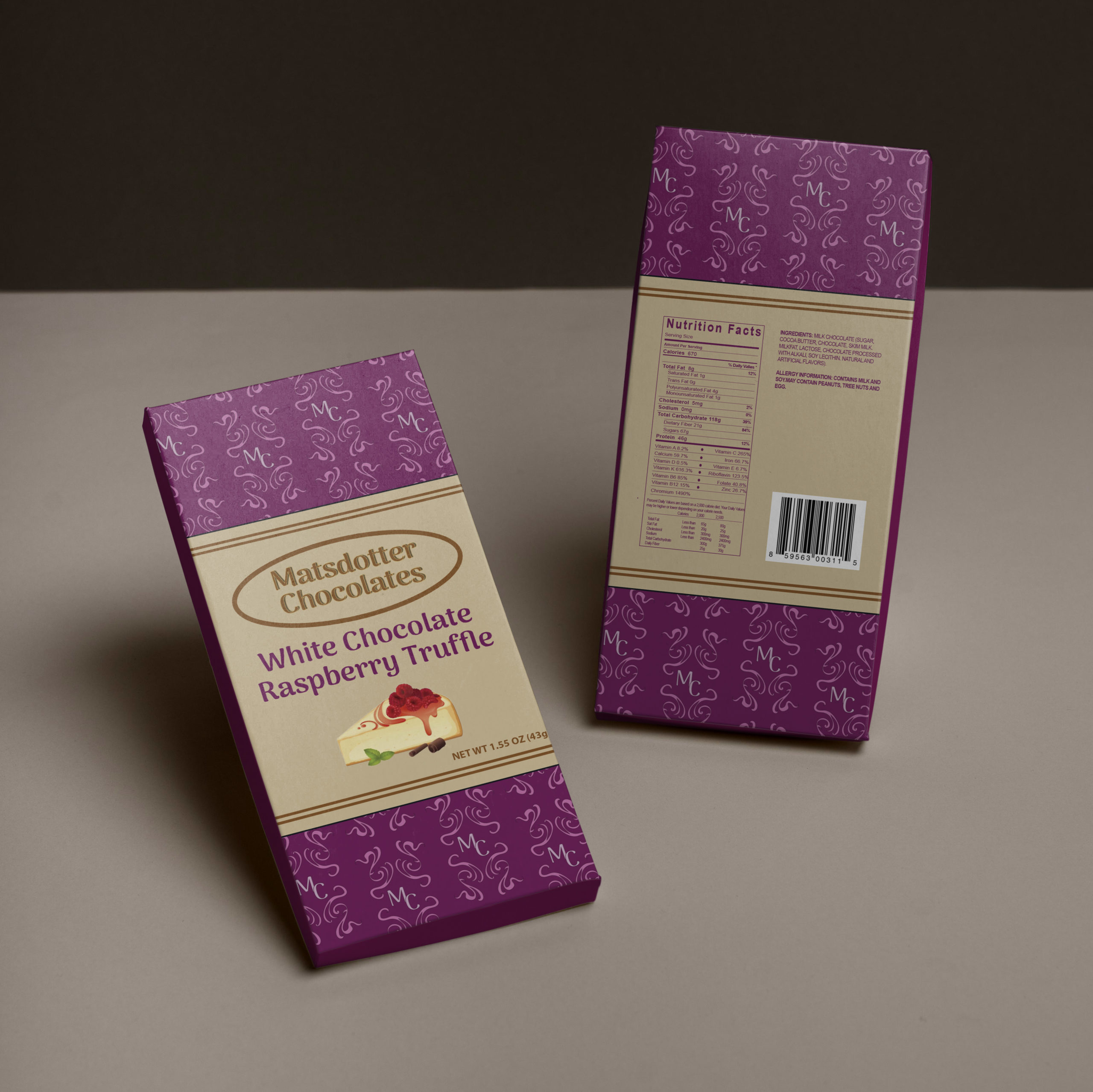
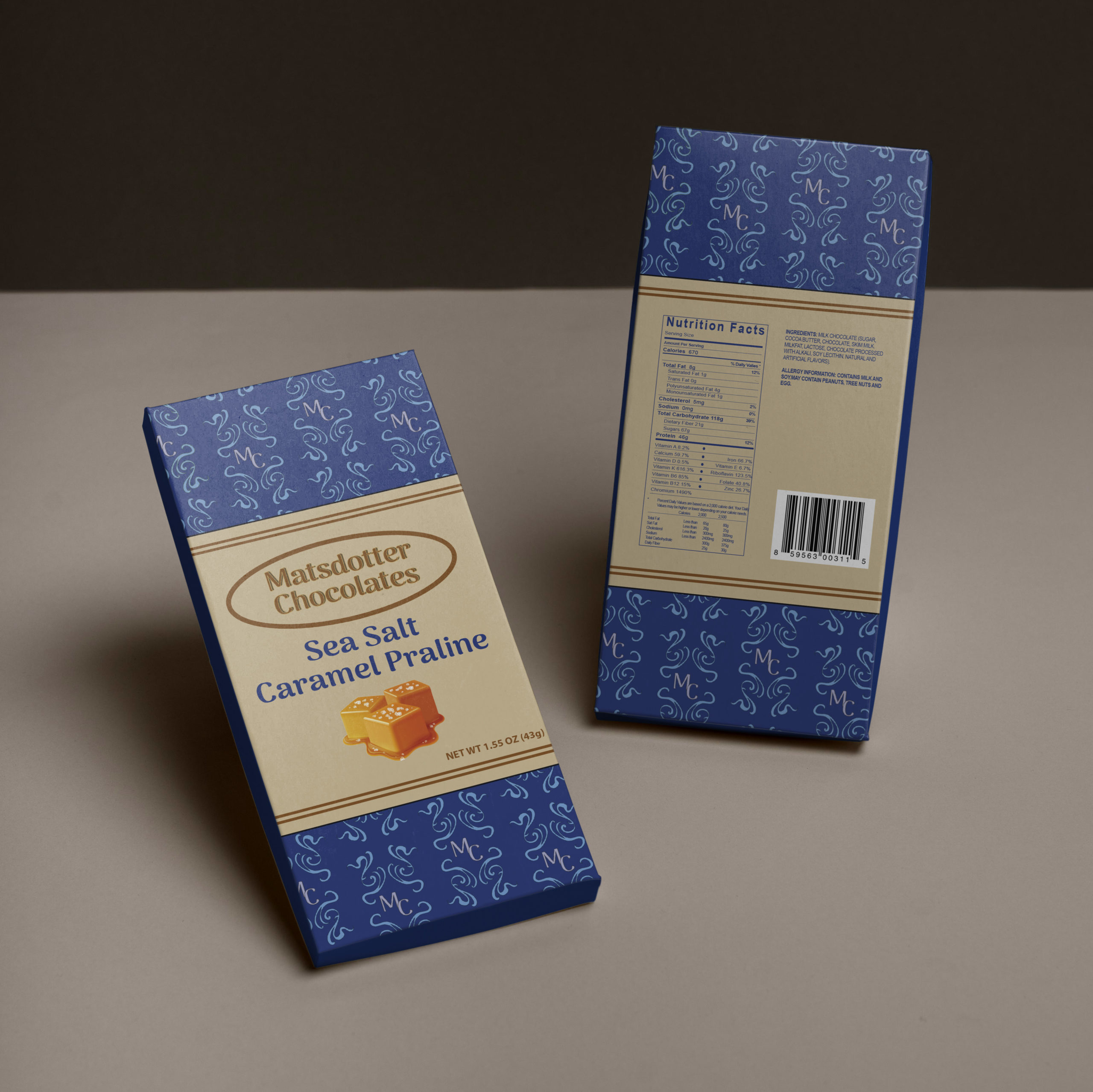
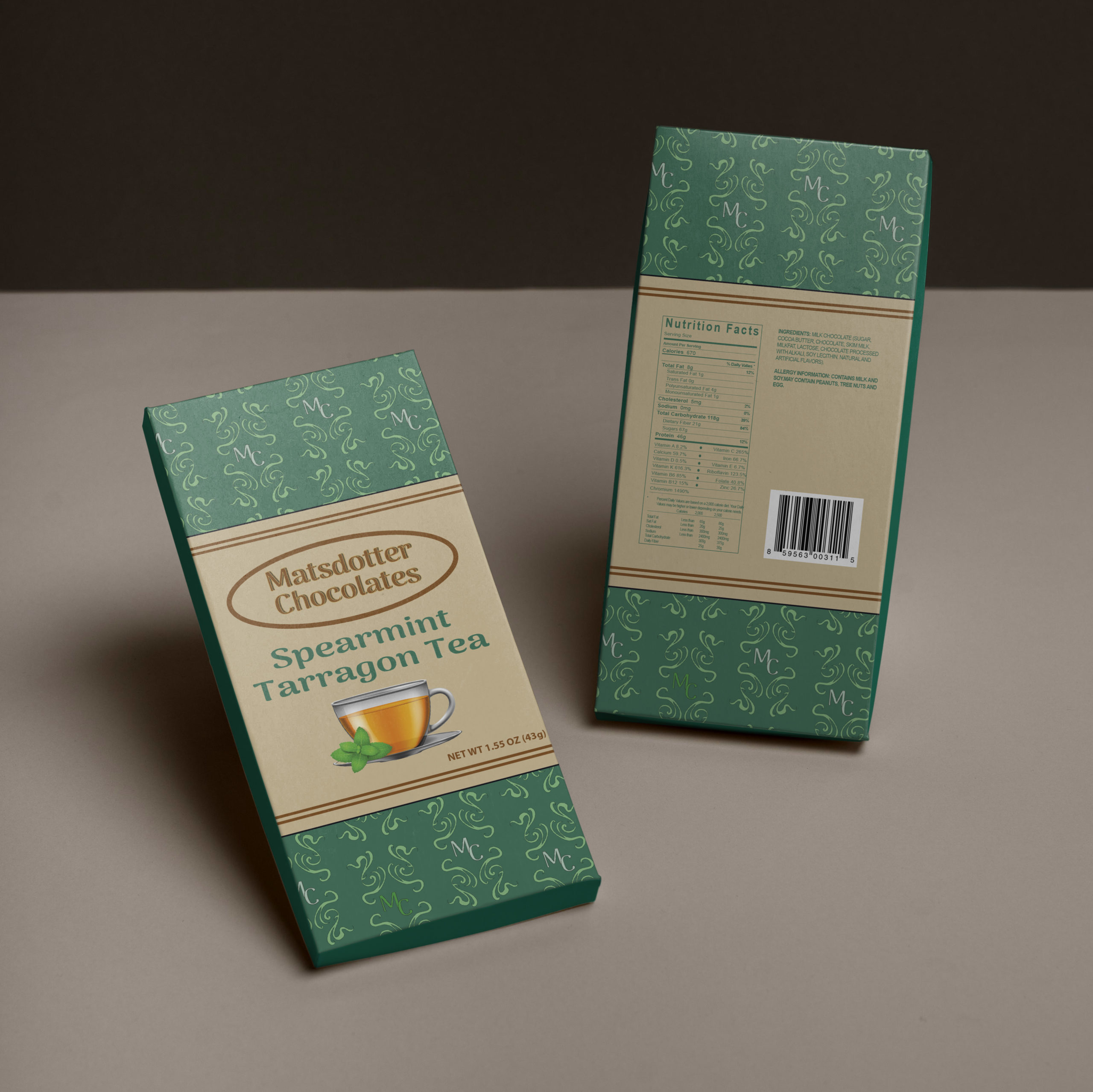
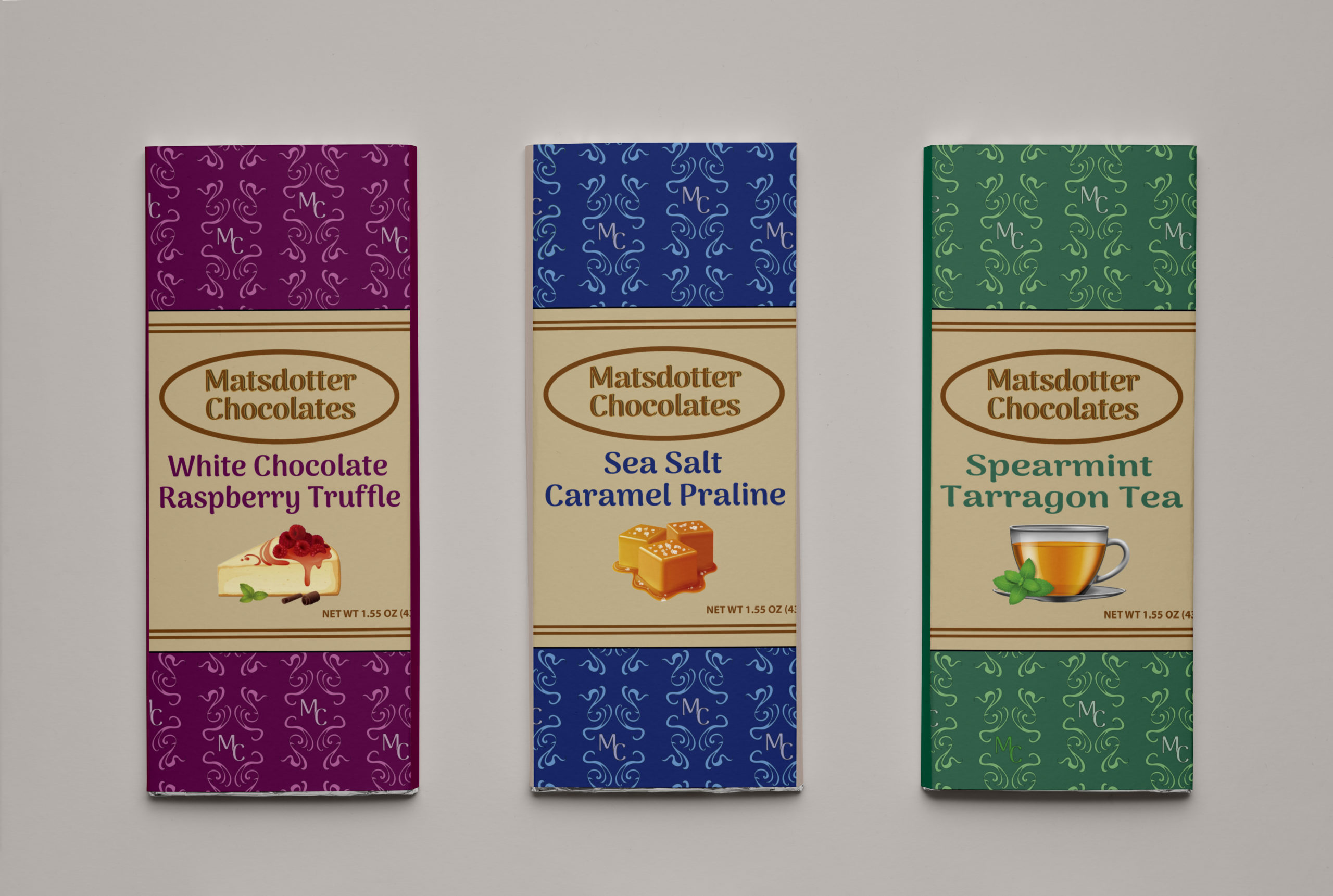
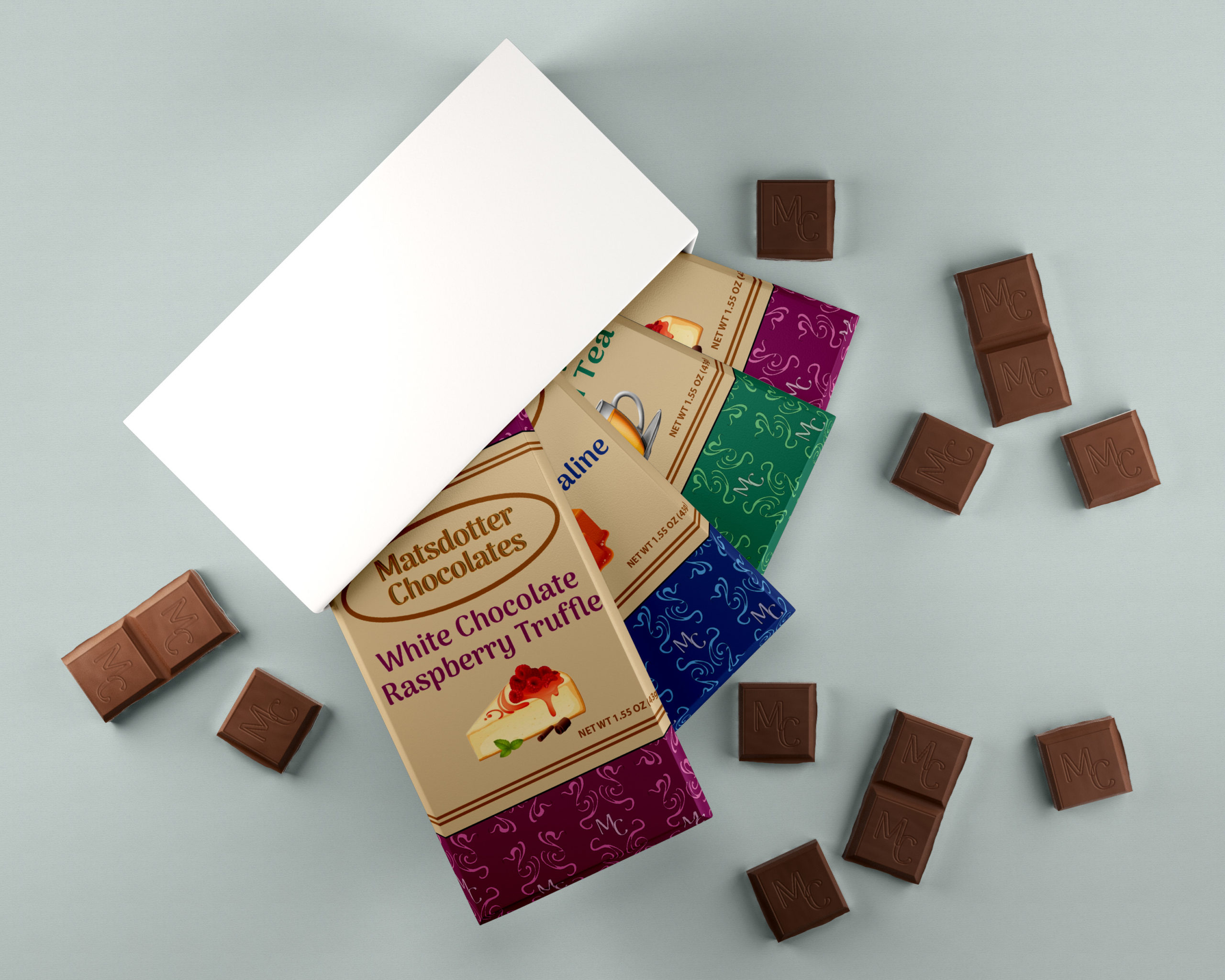
The goal behind Matsdotter Chocolates is to come up with a package design for three different flavors of chocolate. The package design should be inclusive to all age demographics having a vibrancy in color but also a sophisticated style as well. Each box is in a different color and contains a sleeve. On the back of each box is a description detailing the product to be made with natural and organic materials along with nutrition facts. The logo will be applied for printing and web design purposes, and will be on every package of chocolate. The logo colors align with the package color. The manufacturing of the packages are also eco-friendly. The chocolate squares will have the initial of the brand name along with two slashes to represent money. The design of the packages are fun and the idea of customizing chocolate is a more strategic decision to lure customers as opposed to having the chocolate be a standard flavor which is in various competitors of chocolate companies. The logo indicates the theme of the product and is cohesive to the package design for each flavor. The brand is innovative, environmentally conscious, and charitable in supplying the world with chocolate.
View More Works Below!
